Saul Bass |
||
|
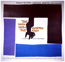
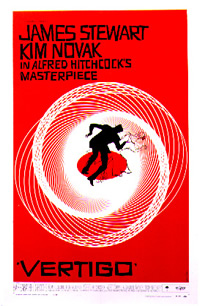
Saul Bass' body of work distinguishes him as one of the most versatile and innovative graphic designers of the 20th Century. Alongside his talent for creating definitive visual references in the form of film poster campaigns and title sequences stands his later work as an Academy Award Winning director for his short film 'Why Man Creates' (1969). In the course of his career, Bass worked with Otto Preminger and Alfred Hitchcock, and his legacy is evident in the work of numerous contemporary designers and directors. But it is his posters that are currently causing the biggest stir. In the past 15 years of working as an original vintage film poster dealer and gallery owner, I have handled some of the rarest posters in the world. Auction prices for posters of The Mummy (1932- $452,000), Metropolis (1926- $356,000) and King Kong (1933- $245,000) have recently reached all time highs. In my opinion, Saul Bass posters for films like 'Vertigo' and 'Anatomy Of A Murder' as exciting as these high-value posters. Contemporary poster collectors of all kinds are giving Bass' designs special attention, and even building collections around key pieces. The effectiveness of his imagery is undeniable, resulting from his constant striving for perfection and his optimistic rejection of stuffy and uninspired conventions, which governed the majority of American poster designers from the 1940s. Saul Bass was born in New York on May 8th 1920 and studied Graphic Art at Brooklyn College, NY before moving to Los Angeles in 1946. Bass was a pioneer of the pared down graphic, favouring minimalist symbolic images, which has been in vogue since he began designing for the film industry in the early 1950s. In 1954, Otto Preminger commissioned Bass to create a visual identity for his film 'Carmen Jones'. Bass came up with a strikingly simple flaming black and red rose. The following year, Preminger again called on Bass to work on 'The Man With The Golden Arm', for which Bass created the famous jagged arm design, suggesting the jarring and disjointed existence of a drug addict. With this design, Bass exploited what he termed the significance of content in design. Bass, along with a small number of other 1950s designers such as Paul Rand and Erik Nitsche, operated against cluttered imagery and towards geometric designs using angular shapes and primary colour schemes. While working on the design for 'The Man with the Golden Arm' Bass asked 'Why not make it move?' Through animation, he created a new style of title sequences, which has since become classic. The thin white lines of the title sequence for 'The Man with the Golden Arm' gradually invade the screen and set the tone for Preminger's tale of a hardened drug addict. For opening sequence of 'Vertigo', Bass used the motif of the revolving Spirograph to evoke the dizzying sensations of the film. He always aimed to create the right climate for the film in question when designing opening sequences, offering audiences a visual feast from the very first frame, and plunging them into the atmosphere of the story that was about to unfold. Thanks to Bass, they no longer had to sit through the tedious credits which had until then been part of the cinematic experience, and which were, in Bass' own words, mere 'popcorn time'. Bass directed the short dream sequence in 'Vertigo' as well as working on the poster campaign for the film. This film marked his most complete collaboration with Hitchcock. Paramount Studios did not censor Bass' work for 'Vertigo' in any way, gave him full credit for his work on the film. It was not customary, until Bass' era for American poster designers to be credited for their work. Once again, Bass spearheaded changes in this area. By signing all his work, he made it possible for the designers to lay rightful claim to their work, and redressed the balance in favour of the artists.
Today,
collectors are showing interest in all Bass' poster designs. In the 1960s, Bass' genius extended to building corporate identities for some of the biggest companies in the USA. He designed the logos for AT&T, Quaker Oats, and Warner Communications, and successfully conveyed the ethos of each of these corporations to the American public. As always, his concern was to replace predictable images with simple, meaningful symbols. His perfectionist drive and his aspiration to always be at the vanguard of all forms of design have bequeathed a legacy of some of the most potent symbols of the 20th Century. I am consistently aware of the influence Bass has had on contemporary film poster designers and on the design world at large. Unashamed references to original Bass designs abound. The poster campaign for Spike Lee's 1995 film 'Crooklyn' offers a humorous and clever reworking of Bass' graphics for 'Anatomy of A Murder'. Today Bass' visual style is echoed everywhere from all forms of advertising to the most prestigious of web site designs.
As
for film poster collectors, I have noticed a shift away from a strict
Saul
Bass died in 1996, in Los Angeles, leaving behind a flourishing
This
article was published in the international magazine, Patek |


|
|
 |
||
|
|
||
|
For
availability of Saul Bass Original Vintage Film Posters visit www.reelposter.com
|
||
|
You
can buy Saul Bass posters from
The Reel Poster Gallery
|
||